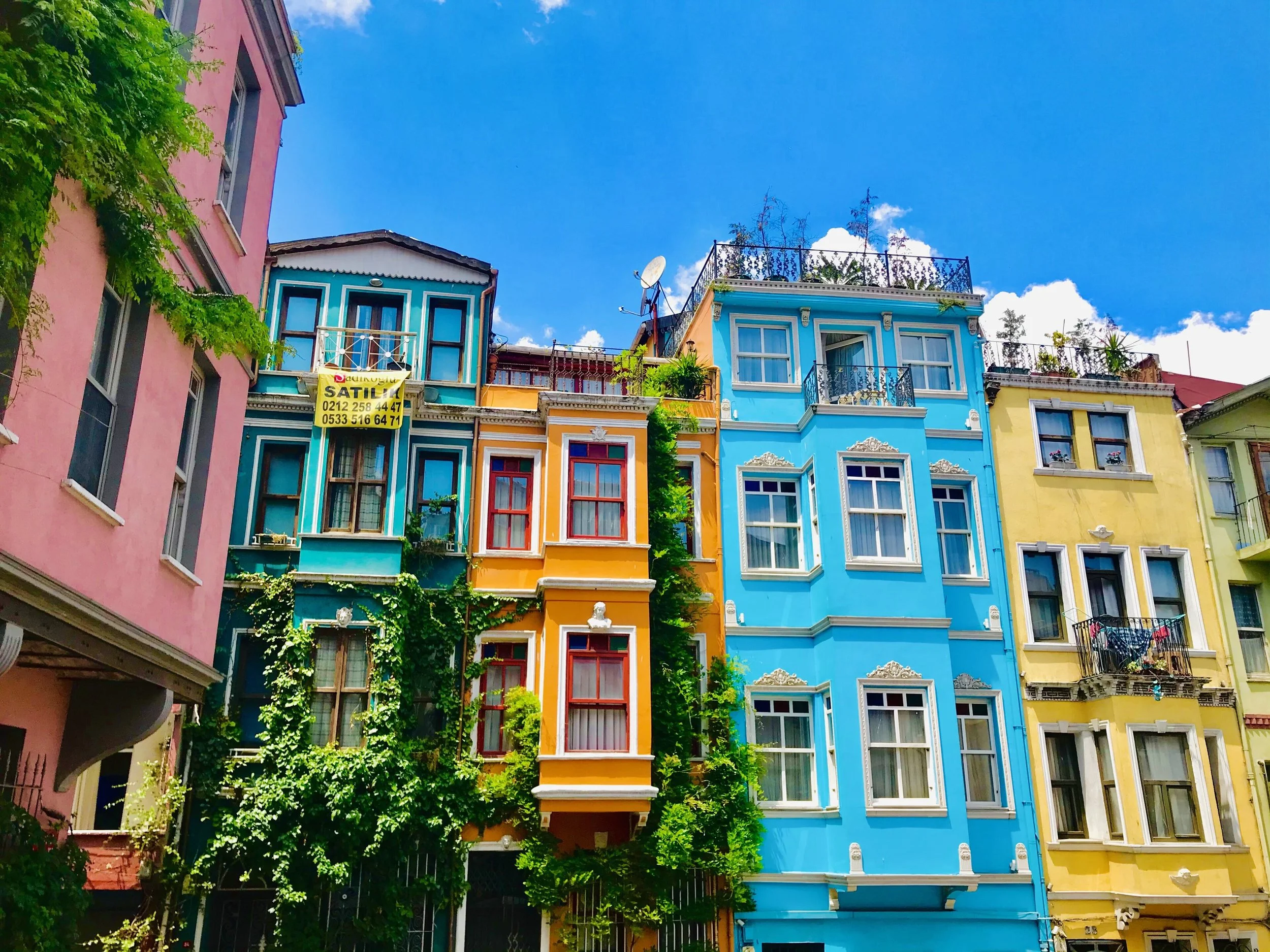
The Powerful Role of Color in Architecture
When we think about architecture, we often focus on form, structure, and materials. But one of the most powerful elements in shaping our experience of a space is often overlooked: color. It’s the first thing we perceive, even before we notice a building’s layout or function. Whether bold or neutral, vibrant or subdued, color has the power to transform how we feel, move, and interact within a space.
Photo by Maurice Flesier via Wikimedia Commons CC BY-SA 4.0
Color and Perception: Shaping How We See Space
Color can visually expand or contract a space. Light, cool tones like sky blue or soft gray can make a room feel open and airy, while darker or warmer hues like terracotta or deep green can create a sense of coziness and intimacy. The direction and quality of natural light also play a major role—shadows, reflections, and changing daylight conditions subtly alter the perception of color throughout the day.
A well-chosen palette can emphasize architectural features, balance proportions, or even influence how warm or cool a room feels—physically and emotionally.
Cultural and Emotional Impact
Colors aren’t just visual; they’re deeply symbolic. Red may evoke energy and urgency in one culture, while representing good fortune in another. Blue is often associated with calm and trust but can also feel cold or distant if overused. These emotional cues matter—especially in spaces where mood and behavior are directly influenced, such as classrooms, healthcare facilities, or retail environments.
Thoughtful color use can reinforce a building’s purpose and resonate more meaningfully with its users. That’s why we always consider context, cultural nuance, and emotional intent when making color decisions.
Function Meets Aesthetic: Using Color Strategically
Beyond beauty, color plays a vital functional role in architecture. In public buildings or large campuses, color can act as a visual guide—distinguishing different zones, aiding wayfinding, or drawing attention to exits, elevators, and signage. In offices, color can designate collaboration zones versus quiet focus areas. In schools and healthcare environments, a soothing palette can reduce stress, while playful pops of color can encourage creativity and engagement.
Color choices aren’t just about style—they support usability and user experience.
Natural Light and Color Interaction
Few things influence color more than light. In northern climates, cool, diffused daylight might mute warm tones. In bright southern settings, sunlight can intensify even the subtlest colors. Windows, overhangs, and skylights all shape how color comes to life over the course of a day.
As architects, we consider how color will behave in different lighting conditions—ensuring the design feels intentional and cohesive morning to night, season to season.
Pops of green thanks to strong biophilic design. (Photo via Wikimedia Commons used under CC0 1.0)
Modern Trends in Architectural Color Use
Today’s architectural palettes are bolder and more experimental than ever. Monochromatic exteriors, biophilic greens, and earthy, sustainable hues are redefining how buildings speak to their surroundings. Interiors are embracing contrast—pairing neutral backdrops with saturated accent colors to create depth and character. In commercial architecture, color can align with brand identity or reflect a company’s values, from innovation to serenity.
Designing with Intent
Along with form and function, color is part of the conversation from the very beginning. Whether we’re working on a calming healthcare space, a bold creative office, or a warm and welcoming home, we use color intentionally to shape experience, support function, and express identity.
Because in architecture, color isn’t just about what you see—it’s about how you feel.
Let’s Talk Color
Curious how color could elevate your next project? Let’s start a conversation and create something that looks good—and feels better.


